接續之前的進度,開始將網頁上方的 Header 區塊加入一些內容,瀏覽 Angular Material2 網站可看已經有一個現成的元件-Toolbar,我們在 src\app\custom-material.module.ts 加入2個元件-MdToolbarModule、MdTooltipModule。
custom-material.module.ts1
2
3
4
5
6
7
8
9
10
11
12
13
14
15
16
17
18
19
20
21
22
23
24
25
26
27
28
29
30
| import { NgModule } from '@angular/core';
import { FlexLayoutModule } from '@angular/flex-layout';
import {
MdIconModule,
MdButtonModule,
MdListModule,
MdToolbarModule,
MdTooltipModule
} from '@angular/material';
@NgModule({
imports: [
FlexLayoutModule,
MdIconModule,
MdButtonModule,
MdListModule,
MdToolbarModule,
MdTooltipModule
],
exports: [
FlexLayoutModule,
MdIconModule,
MdButtonModule,
MdListModule,
MdToolbarModule,
MdTooltipModule
]
})
export class CustomMaterialModule { }
|
開啟 src\app\home\header\header.component.html,加入 Toolbar 以及圖示按鈕。
header.component.html1
2
3
4
5
6
7
8
9
10
11
12
13
14
| <md-toolbar color="primary">
<span>Angular demo</span>
<span fxFlex></span>
<button md-icon-button mdTooltip="首頁" routerLink="/home">
<md-icon>home</md-icon>
</button>
<button md-icon-button mdTooltip="設定">
<md-icon>settings_input_component</md-icon>
</button>
<button md-icon-button mdTooltip="關於">
<md-icon>info</md-icon>
</button>
</md-toolbar>
|
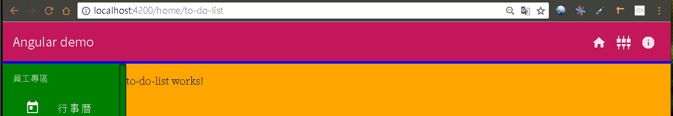
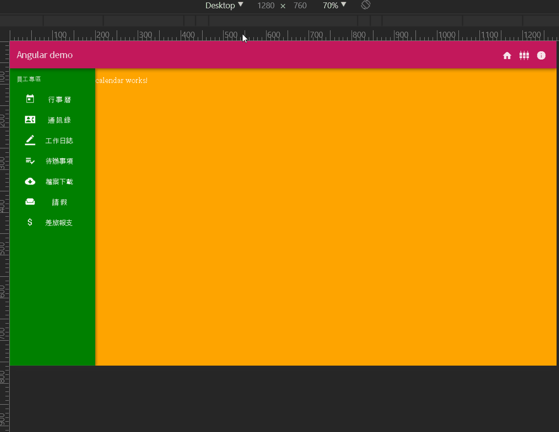
查看結果,畫面看似正常,但是 Header 區塊下方多出一條藍色區域,顯然跟之前在 src\app\home\home.component.html 所設定高度不同,所以直接拿到高度值。
home.component.html1
2
3
4
5
6
7
8
9
10
11
12
13
14
| <div fxFill fxLayout="column" class="layout">
<div class="header">
<app-header></app-header>
</div>
<div fxFlex fxLayout="row" class="main">
<div fxFlex="200px" class="aside scrollbar">
<app-aside></app-aside>
</div>
<div fxFlex class="content">
<router-outlet></router-outlet>
</div>
</div>
</div>
|
開啟 src\app\home\home.component.scss 加入陰影效果。
home.component.scss1
2
3
4
5
6
7
8
9
10
11
12
13
14
15
16
17
18
19
20
| .layout {
background: black;
.header {
background: blue;
box-shadow: 0 3px 5px -1px rgba(0, 0, 0, .2), 0 6px 10px 0 rgba(0, 0, 0, .14), 0 1px 18px 0 rgba(0, 0, 0, .12);
z-index: 20;
}
.main {
background: grey;
.aside {
background: green;
box-shadow: 3px 0 6px rgba(0, 0, 0, .24);
z-index: 10;
}
.content {
background: orange;
}
}
}
|
Sidenav
參考官網 Sidenav 範例。 src\app\custom-material.module.ts 加入 MdSidenavModule。
custom-material.module.ts1
2
3
4
5
6
7
8
9
10
11
12
13
14
15
16
17
18
19
20
21
22
23
24
25
26
27
28
29
30
31
32
33
| import { NgModule } from '@angular/core';
import { FlexLayoutModule } from '@angular/flex-layout';
import {
MdIconModule,
MdButtonModule,
MdListModule,
MdToolbarModule,
MdTooltipModule,
MdSidenavModule
} from '@angular/material';
@NgModule({
imports: [
FlexLayoutModule,
MdIconModule,
MdButtonModule,
MdListModule,
MdToolbarModule,
MdTooltipModule,
MdSidenavModule
],
exports: [
FlexLayoutModule,
MdIconModule,
MdButtonModule,
MdListModule,
MdToolbarModule,
MdTooltipModule,
MdSidenavModule
]
})
export class CustomMaterialModule { }
|
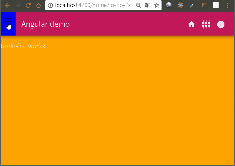
將 Sidenav 加到 src\app\home\home.component.html,並在 Header 區塊加入一個開啟按鈕。
home.component.html1
2
3
4
5
6
7
8
9
10
11
12
13
14
15
16
17
18
19
| <div fxFill fxLayout="column" class="layout">
<div class="header" fxLayout="row">
<button md-icon-button (click)="sidenav.open()">
<md-icon>menu</md-icon>
</button>
<app-header fxFlex></app-header>
</div>
<div fxFlex fxLayout="row" class="main">
<md-sidenav-container fxFill>
<md-sidenav #sidenav mode="over" class="aside">
<app-aside fxFlex="200px"></app-aside>
</md-sidenav>
<div fxFlex class="content">
<router-outlet></router-outlet>
</div>
</md-sidenav-container>
</div>
</div>
|
Flex-Layout:fxHide & fxShow
Angular Flex-Layout 提供了 fxHide 來隱藏目前的元素,以及 fxShow 來顯示目前的元素,後面可以再加上分段點來決定要在什麼尺寸觸發。
利用這個效果我們可以模擬出類似響應式網站的效果,依照需要調整的尺寸建立一種樣板,再搭配 fxHide 與 fxShow 讓不同尺寸顯示對應的樣板,開啟 src\app\home\home.component.html 並修改如下:
home.component.html1
2
3
4
5
6
7
8
9
10
11
12
13
14
15
16
17
18
19
20
21
22
| <div fxFill fxLayout="column" class="layout">
<div class="header" fxLayout="row">
<button md-icon-button (click)="sidenav.open()" fxHide fxShow.xs>
<md-icon>menu</md-icon>
</button>
<app-header fxFlex></app-header>
</div>
<div fxFlex fxLayout="row" class="main">
<div fxFlex="200px" class="aside" fxHide.xs>
<app-aside></app-aside>
</div>
<md-sidenav-container fxFlex>
<md-sidenav #sidenav mode="over" class="aside" fxHide fxShow.xs>
<app-aside fxFlex="200px"></app-aside>
</md-sidenav>
<div fxFlex class="content">
<router-outlet></router-outlet>
</div>
</md-sidenav-container>
</div>
</div>
|
可以看到當用手機尺寸瀏覽時側邊列預設會隱藏起來。
但是目前還有一些問題需要調整:
menu 按鈕應該直接包含在 app-header 內比較恰當。
當用手機尺寸瀏覽時,點選功能選單後雖然內容有切換,但是選單列卻沒有自動縮回去。
也就是說我們需要一個機制讓子元件狀態改變時能夠通知外層的元件。

[**first-app_2017-09-06.zip**](/uploads/first-app_2017-09-06.zip)