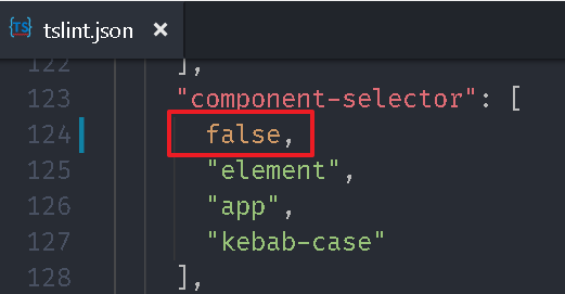
指令 (Directive) & 資料繫結 (Binding) 在 Angular UI:Clarity Design System 中,透過修改 tslint.json 檔的 component-selector 屬性來讓我們可以自訂元件 selector 屬性,現在同樣的來調整 first-app 專案,將 employee 資料夾內的元件改成 emp 開頭,將 home 資料夾內的元件改成 home 開頭。tslint.json 的 component-selector 設定。
selector 屬性。
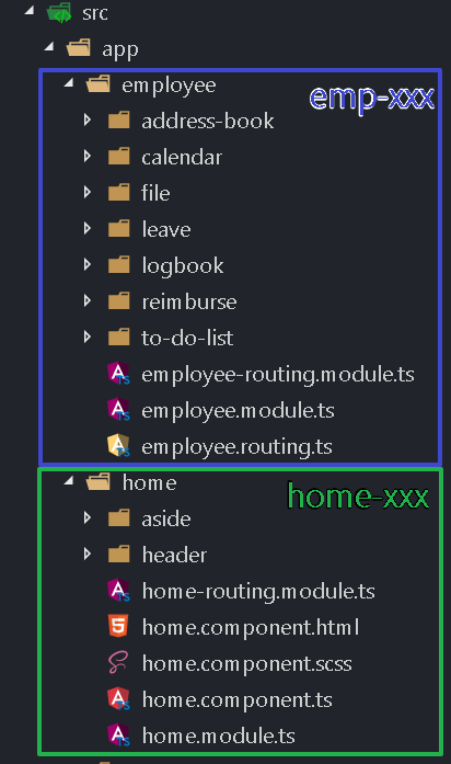
1 2 3 4 5 6 7 8 9 10 11 12 13 14 15 16 17 18 19 20 21 22 23 24 25 26 27 28 29 30 31 32 33 34 35 36 37 38 39 40 41 42 43 44 45 46 47 48 49 50 @Component ({ selector : 'emp-address-book' , ... @Component ({ selector : 'emp-calendar' , ... @Component ({ selector : 'emp-file' , ... @Component ({ selector : 'emp-leave' , ... @Component ({ selector : 'emp-logbook' , ... @Component ({ selector : 'emp-reimburse' , ... @Component ({ selector : 'emp-to-do-list' , ... @Component ({ selector : 'home-aside' , ... @Component ({ selector : 'home-header' , ... @Component ({ selector : 'home' , ...
修改 src\app\home\home.component.html,將 app-header 改為 home-header,app-aside 改為 home-aside。
home.component.html 1 2 3 4 5 6 7 8 9 10 11 12 13 14 15 16 17 18 19 <div fxFill fxLayout ="column" class ="layout" > <div class ="header" fxLayout ="row" > <home-header fxFlex (sidenavClick )="sidenav.open()" > </home-header > </div > <div fxFlex fxLayout ="row" class ="main" > <div fxFlex ="200px" class ="aside" fxHide.xs > <home-aside (menuClick )="sidenav.close()" > </home-aside > </div > <md-sidenav-container fxFlex > <md-sidenav #sidenav mode ="over" class ="aside" fxHide fxShow.xs > <home-aside fxFlex ="200px" (menuClick )="sidenav.close()" > </home-aside > </md-sidenav > <div fxFlex class ="content" > <router-outlet > </router-outlet > </div > </md-sidenav-container > </div > </div >
編輯行事曆 其實網路上已經有一些 Angular 版本的元件可以套用,不過這邊我們練習如何用簡單的方式就可以做出一個雛形。src\app\custom-material.module.ts 加入 MdCardModule
custom-material.module.ts 1 2 3 4 5 6 7 8 9 10 11 12 13 14 15 16 17 18 19 20 21 22 23 24 25 26 27 28 29 30 31 32 33 34 35 36 import { NgModule } from '@angular/core' ;import { FlexLayoutModule } from '@angular/flex-layout' ;import { MdIconModule, MdButtonModule, MdListModule, MdToolbarModule, MdTooltipModule, MdSidenavModule, MdCardModule } from '@angular/material' ; @NgModule ({ imports : [ FlexLayoutModule, MdIconModule, MdButtonModule, MdListModule, MdToolbarModule, MdTooltipModule, MdSidenavModule, MdCardModule ], exports : [ FlexLayoutModule, MdIconModule, MdButtonModule, MdListModule, MdToolbarModule, MdTooltipModule, MdSidenavModule, MdCardModule ] }) export class CustomMaterialModule
開啟 src\app\employee\employee.module.ts,將 CustomMaterialModule 註冊到裡面。
employee.module.ts 1 2 3 4 5 6 7 8 9 10 11 12 13 14 15 16 17 18 19 20 21 22 23 24 25 26 27 28 29 30 import { NgModule } from '@angular/core' ;import { CommonModule } from '@angular/common' ;import { CalendarComponent } from './calendar/calendar.component' ;import { AddressBookComponent } from './address-book/address-book.component' ;import { LogbookComponent } from './logbook/logbook.component' ;import { ToDoListComponent } from './to-do-list/to-do-list.component' ;import { FileComponent } from './file/file.component' ;import { LeaveComponent } from './leave/leave.component' ;import { ReimburseComponent } from './reimburse/reimburse.component' ;import { EmployeeRoutingModule } from './employee-routing.module' ;import { CustomMaterialModule } from '../custom-material.module' ;@NgModule ({ imports : [ CommonModule, EmployeeRoutingModule, CustomMaterialModule ], declarations : [ CalendarComponent, AddressBookComponent, LogbookComponent, ToDoListComponent, FileComponent, LeaveComponent, ReimburseComponent ] }) export class EmployeeModule
開啟 src\app\employee\calendar\calendar.component.html,加入 card 元件,以及月份切換按鈕。
calendar.component.html 1 2 3 4 5 6 7 8 9 10 11 12 13 14 15 16 <md-card > <md-card-header > <md-card-title > 行事曆</md-card-title > <md-card-subtitle > <h1 > 2017 年 9 月</h1 > </md-card-subtitle > </md-card-header > <md-card-content > </md-card-content > <md-card-actions > <button md-button > 上個月</button > <button md-button > 本月</button > <button md-button > 下個月</button > </md-card-actions > </md-card >
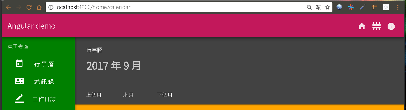
執行專案,從瀏覽器上可以看到最外層的卡片效果。
Binding:內嵌繫結 (interpolation) 在 Angular 事件 中,我們學會 事件繫結 ,透過 小括號 (( event )) 的方式讓前端樣板狀態變更時可以通知後端元件。內嵌繫結 (interpolation ),我們可以透過2個大括號({{ variable }})方式將元件所對應 ts 檔的變數嵌入到樣板上。
若是私有(private)變數則無法存取,若變數沒有加上存取修飾詞,那預設值就是 public。
開啟 src\app\employee\calendar\calendar.component.ts,加入變數 selectedMonth,並提供方法 將日期轉成文字格式給 selectedMonth。
calendar.component.ts 1 2 3 4 5 6 7 8 9 10 11 12 13 14 15 16 17 18 19 20 21 22 23 24 25 26 27 28 29 30 31 32 import { Component, OnInit } from '@angular/core' ;@Component ({ selector : 'emp-calendar' , templateUrl : './calendar.component.html' , styleUrls : ['./calendar.component.scss' ] }) export class CalendarComponent implements OnInit selectedDay : Date ; selectedMonth = '' ; constructor ( ngOnInit ( this .getToday(); } getToday ( this .selectedDay = new Date (); this .getDay(); } getDay ( let year = this .selectedDay.getFullYear(); let month = this .selectedDay.getMonth(); month++; if (month === 13 ) { month = 1 ; year++; } this .selectedMonth = `${year} 年 ${month} 月` ; } }
TypeScript 在宣告變數時必須給定型別 ,例如:boolean、number、string、any、…,格式是在變數後面加上冒號(:)再加上型別,但是如果有給初始值時可以省略,因為 TypeScript 會自動依初始值來推斷變數的型別,後續程式邏輯若給予的值與型別不符時就會出現警告。開發時期 的型別檢查。any 算是比較特殊的型別,代表它可以是任意型別,當變數設成 any 時,我們可以視為 TypeScript 就不會做檢查,當變數的值可能為不同型別時可以使用,但是宣告成 any 也代表失去 TypeScript 的檢核機制,建議盡量避免使用。const 宣告,如果值會改變時則用 let。
修改 calendar.component.html,套用 selectedMonth 變數。
calendar.component.html 1 2 3 4 5 6 7 8 9 10 11 12 13 14 15 16 <md-card > <md-card-header > <md-card-title > 行事曆</md-card-title > <md-card-subtitle > <h1 > { {selectedMonth} }</h1 > </md-card-subtitle > </md-card-header > <md-card-content > </md-card-content > <md-card-actions > <button md-button > 上個月</button > <button md-button > 本月</button > <button md-button > 下個月</button > </md-card-actions > </md-card >
從瀏覽器上看不出改變,但是月份已經用變數取代。
加入月份切換功能 修改 calendar.component.html,為切換按鈕加入事件,並透過 事件繫結 綁定。
calendar.component.html 1 2 3 4 5 6 7 8 9 10 11 12 13 14 15 16 <md-card > <md-card-header > <md-card-title > 行事曆</md-card-title > <md-card-subtitle > <h1 > { {selectedMonth} }</h1 > </md-card-subtitle > </md-card-header > <md-card-content > </md-card-content > <md-card-actions > <button md-button (click )="getDay(-1)" > 上個月</button > <button md-button (click )="getToday()" > 本月</button > <button md-button (click )="getDay(1)" > 下個月</button > </md-card-actions > </md-card >
修改 calendar.component.ts 實作對應的方法。
calendar.component.ts 1 2 3 4 5 6 7 8 9 10 11 12 13 14 15 16 17 18 19 20 21 22 23 24 25 26 27 28 29 30 31 32 33 34 35 36 37 38 import { Component, OnInit } from '@angular/core' ;@Component ({ selector : 'emp-calendar' , templateUrl : './calendar.component.html' , styleUrls : ['./calendar.component.scss' ] }) export class CalendarComponent implements OnInit selectedDay : Date ; selectedMonth = '' ; constructor ( ngOnInit ( this .getToday(); } getToday ( this .selectedDay = new Date (); this .getDay(0 ); } getDay (addDMonth: number ) let year = this .selectedDay.getFullYear(); let month = this .selectedDay.getMonth() + addDMonth; const dt = new Date (year, month, 1 ); year = dt.getFullYear(); month = dt.getMonth(); this .selectedDay = new Date (year, month, 1 ); month++; if (month === 13 ) { month = 1 ; year++; } this .selectedMonth = `${year} 年 ${month} 月` ; } }
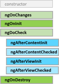
ngOnInit 是 Angular 生命週期
從瀏覽器來看,月份切換已經有效果了
加入 Grid List 開啟 src\app\custom-material.module.ts 加入 MdGridListModule
custom-material.module.ts 1 2 3 4 5 6 7 8 9 10 11 12 13 14 15 16 17 18 19 20 21 22 23 24 25 import { NgModule } from '@angular/core' ;import { FlexLayoutModule } from '@angular/flex-layout' ;import { MdIconModule, ... MdCardModule, MdGridListModule } from '@angular/material' ; @NgModule ({ imports : [ FlexLayoutModule, ... MdCardModule, MdGridListModule ], exports : [ FlexLayoutModule, ... MdCardModule, MdGridListModule ] }) export class CustomMaterialModule
修改 calendar.component.html,加入 Grid List。
calendar.component.html 1 2 3 4 5 6 7 8 9 10 11 12 13 14 15 16 17 18 19 20 21 22 23 24 25 26 27 28 29 30 31 32 33 34 35 36 37 38 39 40 41 42 43 44 45 46 47 48 49 50 51 52 53 54 55 56 <md-card > <md-card-header > <md-card-title > 行事曆</md-card-title > <md-card-subtitle > <h1 > { {selectedMonth} }</h1 > </md-card-subtitle > </md-card-header > <md-card-content > <md-grid-list cols ="7" rowHeight ="68px" > <md-grid-tile > 日</md-grid-tile > <md-grid-tile > 一</md-grid-tile > <md-grid-tile > 二</md-grid-tile > <md-grid-tile > 三</md-grid-tile > <md-grid-tile > 四</md-grid-tile > <md-grid-tile > 五</md-grid-tile > <md-grid-tile > 六</md-grid-tile > <md-grid-tile > 1</md-grid-tile > <md-grid-tile > 2</md-grid-tile > <md-grid-tile > 3</md-grid-tile > <md-grid-tile > 4</md-grid-tile > <md-grid-tile > 5</md-grid-tile > <md-grid-tile > 6</md-grid-tile > <md-grid-tile > 7</md-grid-tile > <md-grid-tile > 8</md-grid-tile > <md-grid-tile > 9</md-grid-tile > <md-grid-tile > 10</md-grid-tile > <md-grid-tile > 11</md-grid-tile > <md-grid-tile > 12</md-grid-tile > <md-grid-tile > 13</md-grid-tile > <md-grid-tile > 14</md-grid-tile > <md-grid-tile > 15</md-grid-tile > <md-grid-tile > 16</md-grid-tile > <md-grid-tile > 17</md-grid-tile > <md-grid-tile > 18</md-grid-tile > <md-grid-tile > 19</md-grid-tile > <md-grid-tile > 20</md-grid-tile > <md-grid-tile > 21</md-grid-tile > <md-grid-tile > 22</md-grid-tile > <md-grid-tile > 23</md-grid-tile > <md-grid-tile > 24</md-grid-tile > <md-grid-tile > 25</md-grid-tile > <md-grid-tile > 26</md-grid-tile > <md-grid-tile > 27</md-grid-tile > <md-grid-tile > 28</md-grid-tile > <md-grid-tile > 29</md-grid-tile > <md-grid-tile > 30</md-grid-tile > <md-grid-tile > 31</md-grid-tile > </md-grid-list > </md-card-content > <md-card-actions > <button md-button (click )="getDay(-1)" > 上個月</button > <button md-button (click )="getToday()" > 本月</button > <button md-button (click )="getDay(1)" > 下個月</button > </md-card-actions > </md-card >
從瀏覽器來看,行事曆的效果已經出現了
從API文件 來看,MdGridListModule 與 HTML 的 Table 功能類似。MdGridList 提供一個 cols 的屬性,當內容項目-MdGridTile 超過其數值時就會自動換行,我們設定 7 是因為一個禮拜有7天。MdGridTile 則提供 rowspan、colspan 可以設定所占用的 列數 與 欄位數 ,這邊因為都是占用1單位,所以不設定。
Directive:*ngFor Angular 提供一個樣板指令-*ngFor ,讓我們可以依照陣列物件重複產生樣板語法,同時將資料嵌入到樣板內。calendar.component.ts,加入星期的陣列變數-dayHeaders 。
calendar.component.ts 1 2 3 4 5 6 7 8 9 10 11 12 13 import { Component, OnInit } from '@angular/core' ;@Component ({ selector : 'emp-calendar' , templateUrl : './calendar.component.html' , styleUrls : ['./calendar.component.scss' ] }) export class CalendarComponent implements OnInit selectedDay : Date ; selectedMonth = '' ; dayHeaders = ['日' , '一' , '二' , '三' , '四' , '五' , '六' ]; constructor ( ...
修改 calendar.component.html,透過 ngFor 指令來巡覽 dayHeaders 陣列,並宣告一個 變數(header) 來承接其值,最後再透過header 嵌入到樣板內。
calendar.component.html 1 2 3 4 5 6 7 8 9 10 11 12 13 14 <md-card > <md-card-header > <md-card-title > 行事曆</md-card-title > <md-card-subtitle > <h1 > { {selectedMonth} }</h1 > </md-card-subtitle > </md-card-header > <md-card-content > <md-grid-list cols ="7" rowHeight ="68px" > <md-grid-tile *ngFor ="let header of dayHeaders" > <h3 > { {header} }</h3 > </md-grid-tile > <md-grid-tile > 1</md-grid-tile > ...
從瀏覽器上看不出改變,但是星期已經用變數取代。
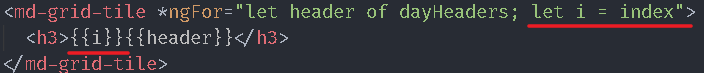
*ngFor 本身還提供下列變數可使用:index (number):表示目前資料在陣列中的索引值。first (boolean):表示目前資料是否為第一筆。last (boolean):表示目前資料是否為最後一筆。even (boolean):表示目前資料的索引值是否為偶數筆。odd (boolean):表示目前資料的索引值是否為奇數筆。i 來承接 index 索引值,並將 i 嵌入到星期變數前面。
Directive:NgStyle Angular 提供一個類似 style tag 的指令-[ngStyle],最大的差異就是 [ngStyle] 所設定CSS的屬性值可以是變數、方法,也就是我們可以動態改變值。calendar.component.ts,加入星期的顏色陣列變數-dayColors 。
calendar.component.ts 1 2 3 4 5 6 7 8 9 10 11 12 13 14 import { Component, OnInit } from '@angular/core' ;@Component ({ selector : 'emp-calendar' , templateUrl : './calendar.component.html' , styleUrls : ['./calendar.component.scss' ] }) export class CalendarComponent implements OnInit selectedDay : Date ; selectedMonth = '' ; dayHeaders = ['日' , '一' , '二' , '三' , '四' , '五' , '六' ]; dayColors = ['red' , 'white' , 'white' , 'white' , 'white' , 'white' , 'green' ]; constructor ( ...
開啟 calendar.component.html,加入 ngStyle 將文字顏色來源指向 dayColors 。
calendar.component.html 1 2 3 4 5 6 7 8 9 10 11 12 13 14 15 <md-card > <md-card-header > <md-card-title > 行事曆</md-card-title > <md-card-subtitle > <h1 > { {selectedMonth} }</h1 > </md-card-subtitle > </md-card-header > <md-card-content > <md-grid-list cols ="7" rowHeight ="68px" > <md-grid-tile *ngFor ="let header of dayHeaders; let i = index" [ngStyle ]="{'color': dayColors[i]}" > <h3 > { {header} }</h3 > </md-grid-tile > <md-grid-tile > 1</md-grid-tile > ...
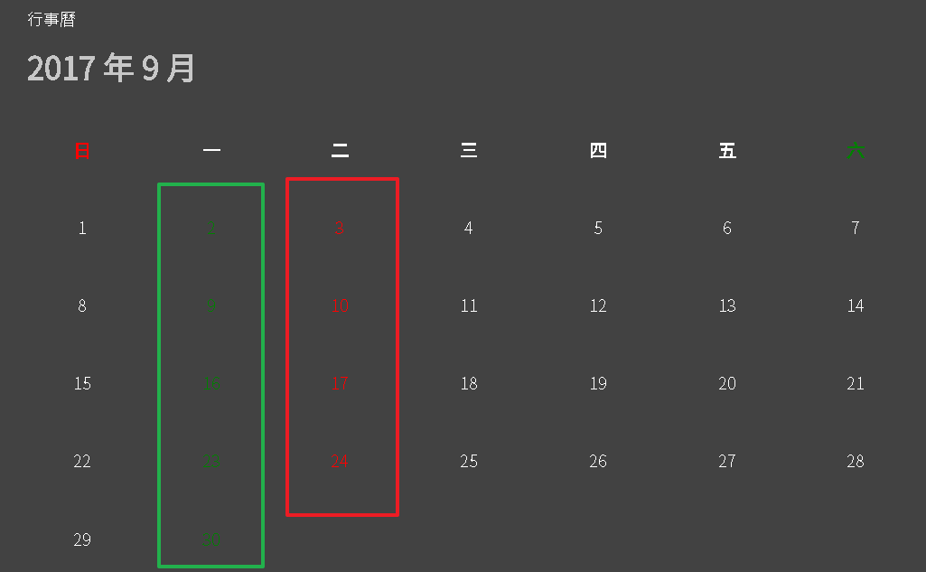
從瀏覽器上可以看到星期日變成紅色、星期六變成綠色。calendar.component.ts,新增 days 陣列變數,在 getDay(addDMonth) 方法內將選取月份的日期與星期都填入 days 內。
calendar.component.ts 1 2 3 4 5 6 7 8 9 10 11 12 13 14 15 16 17 18 19 20 21 22 23 24 25 26 27 28 29 30 31 32 33 34 35 36 37 38 39 40 41 ... export class CalendarComponent implements OnInit selectedDay : Date ; selectedMonth = '' ; dayHeaders = ['日' , '一' , '二' , '三' , '四' , '五' , '六' ]; dayColors = ['red' , 'white' , 'white' , 'white' , 'white' , 'white' , 'green' ]; days = []; constructor ( ... getDay (addDMonth: number ) let year = this .selectedDay.getFullYear(); let month = this .selectedDay.getMonth() + addDMonth; const dt = new Date (year, month, 1 ); year = dt.getFullYear(); month = dt.getMonth(); const _days = []; for (let day = 1 ; day <= 31 ; day++) { const time = new Date (year, month, day); if (time.getMonth() > month) { break ; } const d: any = { day : day, week : time.getDay() }; _days.push(d); } this .days = [..._days]; this .selectedDay = new Date (year, month, 1 ); month++; if (month === 13 ) { month = 1 ; year++; } this .selectedMonth = `${year} 年 ${month} 月` ; } }
開啟 calendar.component.html,加入 ngStyle 將文字顏色來源指向 dayColors 。
calendar.component.html 1 2 3 4 5 6 7 8 9 10 11 12 13 ... <md-card-content > <md-grid-list cols ="7" rowHeight ="68px" > <md-grid-tile *ngFor ="let header of dayHeaders; let i = index" [ngStyle ]="{'color': dayColors[i]}" > <h3 > </h3 > </md-grid-tile > <md-grid-tile *ngFor ="let item of days" [ngStyle ]="{'color': dayColors[item.week]}" > <span > </span > </md-grid-tile > </md-grid-list > ...
從瀏覽器上可以看到日期為星期日與星期六的顏色都改變了,但是位置不對,2017/9/1 應該是禮拜五。
Binding:屬性繫結 (Property Binding) 上面提到的 內嵌繫結 可以將後端元件類別變數輸出到前端樣板,但是它最終會轉換成文字,如果我們需要繫結對象是樣板元素的屬性時可能就會不適用,因此 Angular 提供另一種資料繫結模式-屬性繫結 ,我們可以在目標屬性上加上 中括號 ([ property ]) 來表示資料來源是來自元件類別。
屬性繫結 的資料如果是字串,可以在值外面加上單引號來表示值為字串。
我們在每月1號的 md-grid-tile 前面再插入一個 md-grid-tile,並透過 colspan 屬性將1號推擠到對應的星期。calendar.component.ts,新增 lastMonth_colspan 變數,在 getDay(addDMonth) 方法內計算需要偏移的天數。
calendar.component.ts 1 2 3 4 5 6 7 8 9 10 11 12 13 14 15 16 17 18 19 20 ... export class CalendarComponent implements OnInit selectedDay : Date ; selectedMonth = '' ; dayHeaders = ['日' , '一' , '二' , '三' , '四' , '五' , '六' ]; dayColors = ['red' , 'white' , 'white' , 'white' , 'white' , 'white' , 'green' ]; days = []; lastMonth_colspan = 0 ; constructor ( ... getDay (addDMonth: number ) let year = this .selectedDay.getFullYear(); let month = this .selectedDay.getMonth() + addDMonth; const dt = new Date (year, month, 1 ); year = dt.getFullYear(); month = dt.getMonth(); this .lastMonth_colspan = new Date (year, month, 1 ).getDay(); const _days = []; ...
開啟 calendar.component.html,加入一個 md-grid-tile,並透過屬性繫結 將 colspan 屬性繫結至 lastMonth_colspan 變數。
calendar.component.html 1 2 3 4 5 6 7 8 9 10 11 12 13 14 ... <md-card-content > <md-grid-list cols ="7" rowHeight ="68px" > <md-grid-tile *ngFor ="let header of dayHeaders; let i = index" [ngStyle ]="{'color': dayColors[i]}" > <h3 > </h3 > </md-grid-tile > <md-grid-tile [colspan ]="lastMonth_colspan" > </md-grid-tile > <md-grid-tile *ngFor ="let item of days" [ngStyle ]="{'color': dayColors[item.week]}" > <span > </span > </md-grid-tile > </md-grid-list > ...
從瀏覽器上看起來應該都是正常。
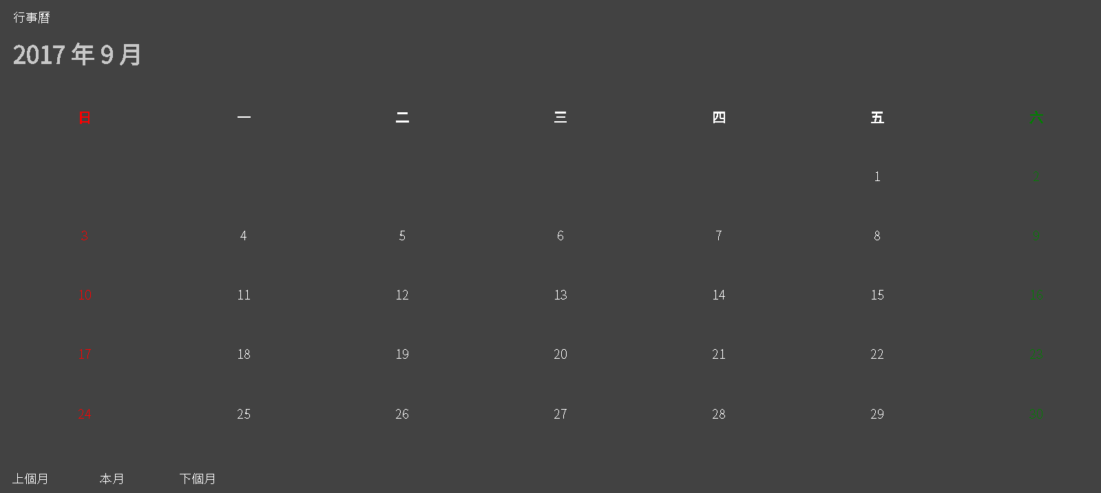
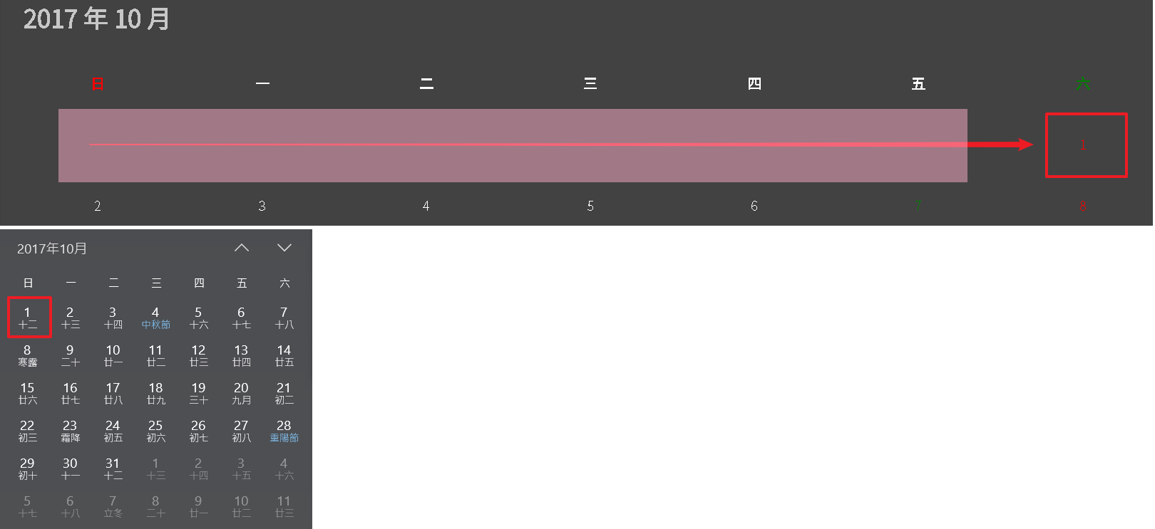
Directive:*ngFor 我們切換到下個月(2017/10)問題就出現了,原本 2017/10/1 應該是星期日,但是卻被移到星期六。lastMonth_colspan = 0 時表示不需要推移,因此應該移除日期前的 md-grid-tile,Angular 提供一個便捷的樣板指令-*ngFor ,當後面的判斷式為 true 時該樣板元素會顯示,當值為 false 時該樣板元素會被移除。calendar.component.html,添加 *ngFor 判斷式。
calendar.component.html 1 2 3 4 5 6 7 8 9 ... <md-card-content > <md-grid-list cols ="7" rowHeight ="68px" > <md-grid-tile *ngFor ="let header of dayHeaders; let i = index" [ngStyle ]="{'color': dayColors[i]}" > <h3 > </h3 > </md-grid-tile > <md-grid-tile [colspan ]="lastMonth_colspan" *ngIf ="lastMonth_colspan" > </md-grid-tile > ...
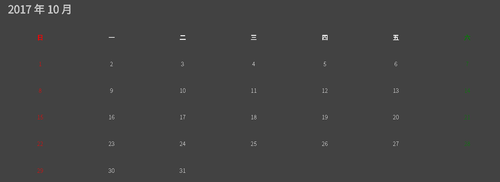
從瀏覽器上看起來 2017/10 月份行事曆應該就正常。src\app\employee\calendar\calendar.component.scss 加上一點 CSS 樣式,並套用到 calendar.component.html。
calendar.component.scss 1 2 3 4 5 6 7 8 9 .day { border : solid 1px DimGray; .text { position : absolute; top : 4px ; right : 8px ; } }
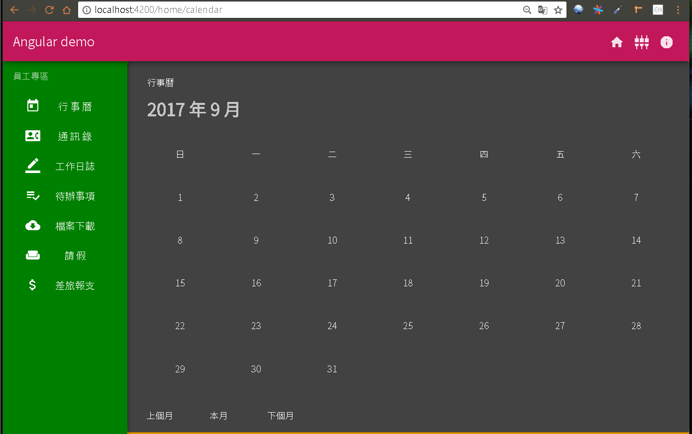
calendar.component.html 1 2 3 4 5 6 7 8 9 10 11 12 13 14 15 16 17 18 19 20 21 22 23 24 25 26 27 <md-card > <md-card-header > <md-card-title > 行事曆</md-card-title > <md-card-subtitle > <h1 > </h1 > </md-card-subtitle > </md-card-header > <md-card-content > <md-grid-list cols ="7" rowHeight ="68px" > <md-grid-tile *ngFor ="let header of dayHeaders; let i = index" [ngStyle ]="{'color': dayColors[i]}" > <h3 > </h3 > </md-grid-tile > <md-grid-tile [colspan ]="lastMonth_colspan" *ngIf ="lastMonth_colspan" > </md-grid-tile > <md-grid-tile *ngFor ="let item of days" [ngStyle ]="{'color': dayColors[item.week]}" class ="day" > <span class ="text" > </span > </md-grid-tile > </md-grid-list > </md-card-content > <md-card-actions > <button md-button (click )="getDay(-1)" > 上個月</button > <button md-button (click )="getToday()" > 本月</button > <button md-button (click )="getDay(1)" > 下個月</button > </md-card-actions > </md-card >
執行專案,從瀏覽器上操作應該都正常了。
[**first-app_2017-09-12.zip**](/uploads/first-app_2017-09-12.zip)


 [**first-app_2017-09-12.zip**](/uploads/first-app_2017-09-12.zip)