單向繫結(One-Way Binding)
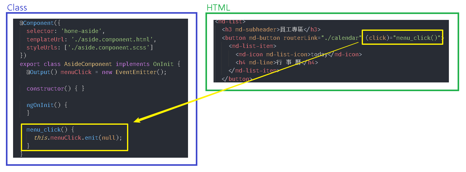
我們在 Angular 事件 中演練了 事件繫結 的應用,在 Angular 指令 & 資料繫結 中演練了 內嵌繫結 與 屬性繫結,這3種資料繫結方式正是 Angular 所提供的單向繫結,其差異如下:
接下來我們開始建置行事曆的明細項目,並且活用繫結的特性讓我們可以減少透過程式邏輯來控制介面。
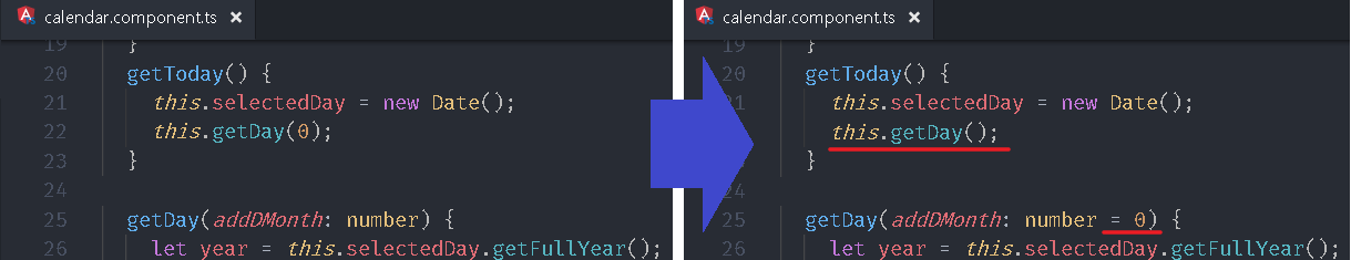
TypeScript:預設值
開啟 src\app\employee\calendar\calendar.component.ts,賦予 getDay 方法參數 addDMonth 預設值 0,透過設定預設值的方式,讓我們在呼叫該方法時可以省略參數,也就是說當呼叫方法時若沒有帶入參數值則 TypeScript 自動帶入預設值。
後續會逐漸加入 TypeScript 的實用技巧,畢竟先學會 TypeScript,再比較 TypeScript 與 JavaScript 哪個比較好才有意義,這會比光看網路上別人的評論來決定還要準確,因為每個人的認知會都不同。
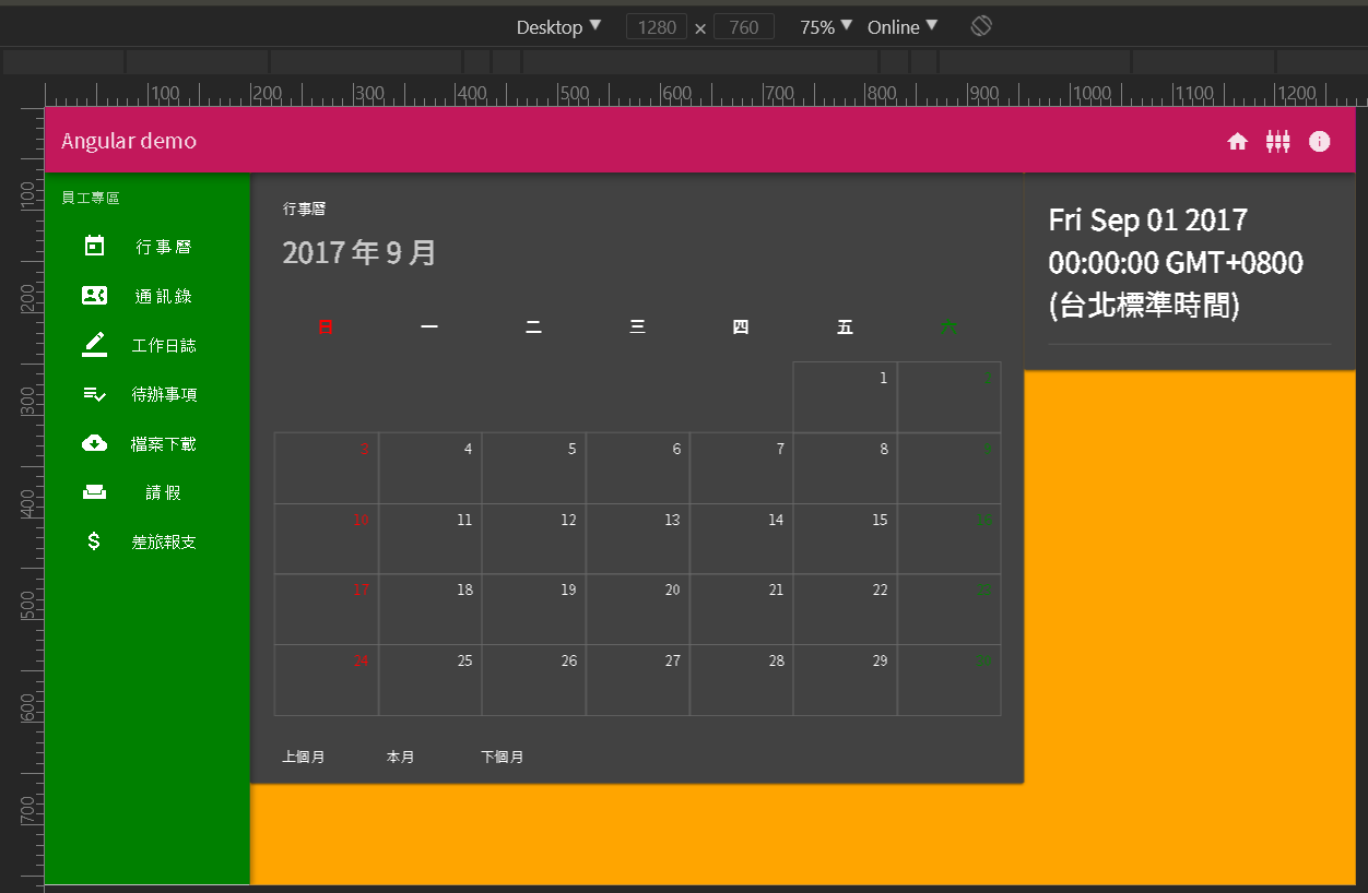
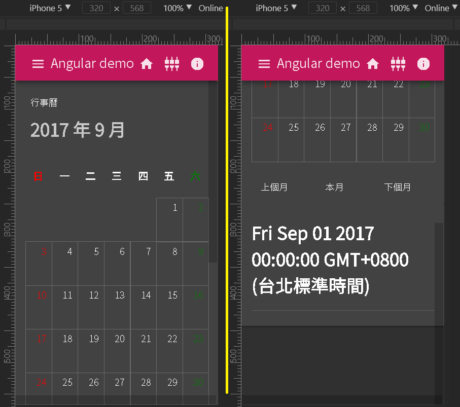
增加明細的顯示區塊
這便再次利用 Angular Flex-Layout 來幫我們切版,開啟 src\app\employee\calendar\calendar.component.html 外層加入 div tag 來分割,預設是水平排列(fxLayout="row"),但是考慮到手機尺寸,我們在加上 fxLayout.xs="column",讓手機尺寸可以改為垂直排列。 行事曆的區塊在水平排列時會占用 70% (fxFlex=”70”),而在垂直排列時則會依內容大小填入,因為 fxLayout 預設模式是填滿(stretch`),所以行事曆就會填滿整個寬度。
calendar.component.html1
2
3
4
5
6
7
8
9
10
11
12
13
14
15
16
17
| <div fxLayout="row" fxLayout.xs="column">
<div fxFlex="70" fxFlex.xs>
<md-card>
...
</md-card>
</div>
<div fxFlex>
<md-card>
<md-card-content>
<h1>{ {selectedDay} }</h1>
<md-divider></md-divider>
</md-card-content>
</md-card>
</div>
</div>
|
用瀏覽器檢視可以看到桌機與手機的差異。
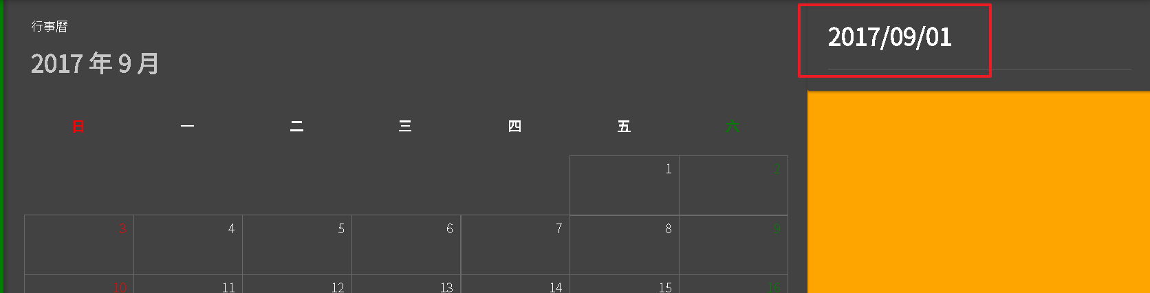
通道 (Pipe)
Angular 提供許多 通道(Pipe) 讓我們可以對 內嵌繫結 的資料再進一步的轉換,很顯然明細區塊的 selectedDay 所顯示的結果並不是我們想要的,因此這邊我們利用 DatePipe 來將日期格式化成 年/月/日。
calendar.component.html1
2
3
4
5
6
7
8
9
10
11
12
13
| <div fxLayout="row" fxLayout.xs="column">
...
<div fxFlex>
<md-card>
<md-card-content>
<h1>{ {selectedDay | date:'yyyy/MM/dd'} }</h1>
<md-divider></md-divider>
</md-card-content>
</md-card>
</div>
</div>
|
Angular 目前提供的通道可以查詢 API 文件
如果功能不敷使用其實我們也可以自己撰寫 Pipe。
日期選取效果
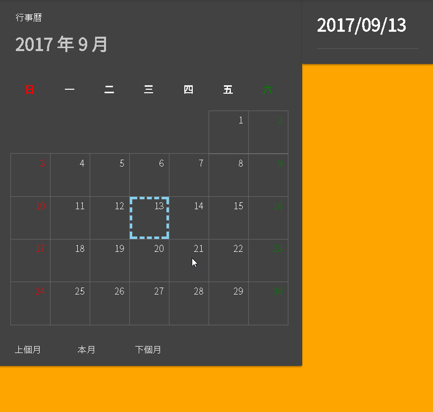
接下來我們在行事曆樣板上的日期 元件(md-grid-tile) 加入點擊(click)的事件,並透過事件繫結來繫結到元件類別的 selectdDay(item) 方法。
接著在 md-grid-tile裡面再加上一個水藍色的 div 外框,並透過 *ngIf 指令來依照 item 的 isSelected 屬性決定是否顯示,接下來只要將選取到的日期所屬 item 的 isSelected 屬性改成 true,其餘改成 false 就可以呈現選取效果。
編輯 calendar.component.html。
calendar.component.html1
2
3
4
5
6
7
8
9
10
11
12
13
14
15
16
17
18
19
20
21
22
23
24
25
26
27
28
29
30
31
32
33
34
35
36
37
38
39
40
41
42
43
| <div fxLayout="row" fxLayout.xs="column">
<div fxFlex="70" fxFlex.xs>
<md-card>
<md-card-header>
<md-card-title>行事曆</md-card-title>
<md-card-subtitle>
<h1>{ {selectedMonth} }</h1>
</md-card-subtitle>
</md-card-header>
<md-card-content>
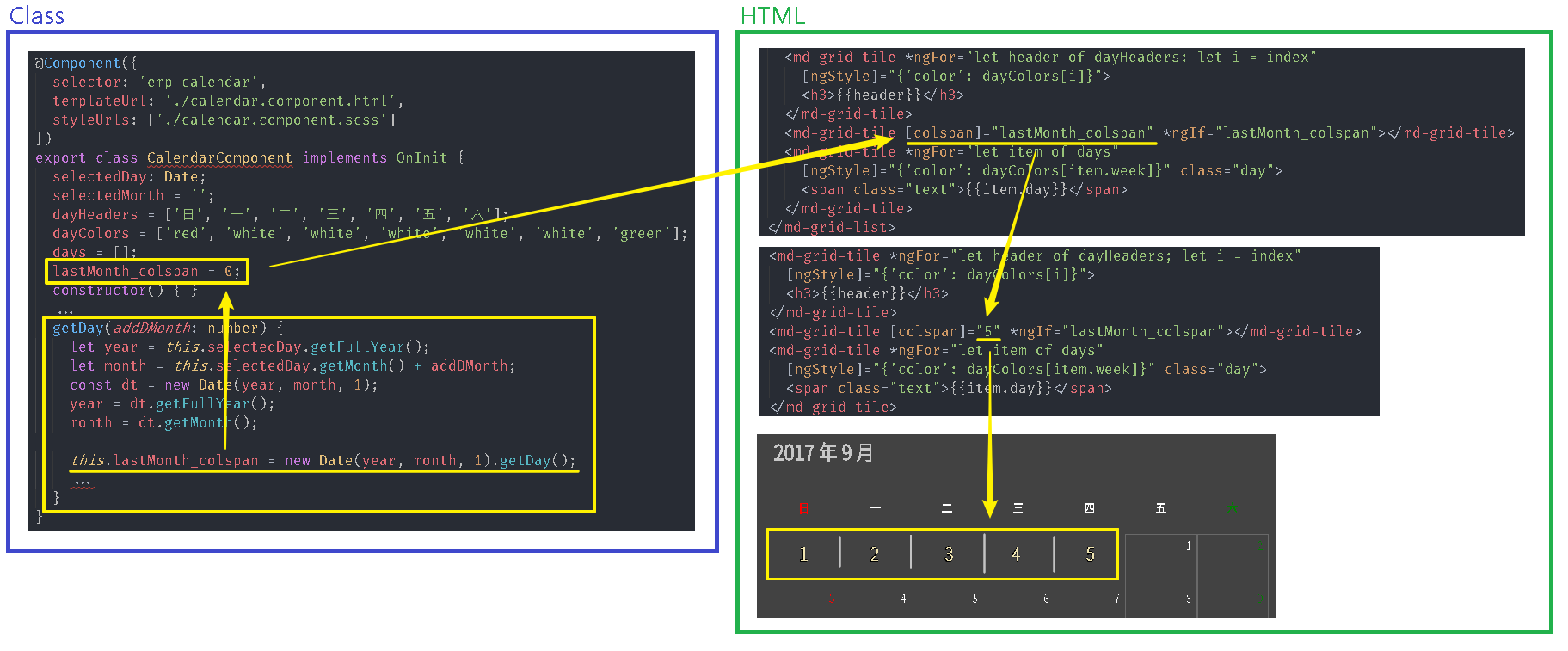
<md-grid-list cols="7" rowHeight="68px">
<md-grid-tile *ngFor="let header of dayHeaders; let i = index" [ngStyle]="{'color': dayColors[i]}">
<h3>{ {header} }</h3>
</md-grid-tile>
<md-grid-tile [colspan]="lastMonth_colspan" *ngIf="lastMonth_colspan"></md-grid-tile>
<md-grid-tile *ngFor="let item of days"
[ngStyle]="{'color': dayColors[item.week]}"
class="day"
(click)="selectdDay(item)">
<div fxFill *ngIf="item.isSelected" class="selected">
</div>
<span class="text">{ {item.day} }</span>
</md-grid-tile>
</md-grid-list>
</md-card-content>
<md-card-actions>
<button md-button (click)="getDay(-1)">上個月</button>
<button md-button (click)="getToday()">本月</button>
<button md-button (click)="getDay(1)">下個月</button>
</md-card-actions>
</md-card>
</div>
<div fxFlex>
<md-card>
<md-card-content>
<h1>{ {selectedDay | date:'yyyy/MM/dd'} }</h1>
<md-divider></md-divider>
</md-card-content>
</md-card>
</div>
</div>
|
編輯 calendar.component.scss。
calendar.component.scss1
2
3
4
5
6
7
8
9
10
11
12
13
14
15
16
| .day {
border: solid 1px DimGray;
.text {
position: absolute;
top: 4px;
right: 8px;
}
.selected {
position: absolute;
top: 0px;
left: 0px;
box-sizing: border-box;
border: dashed 4px skyblue;
}
}
|
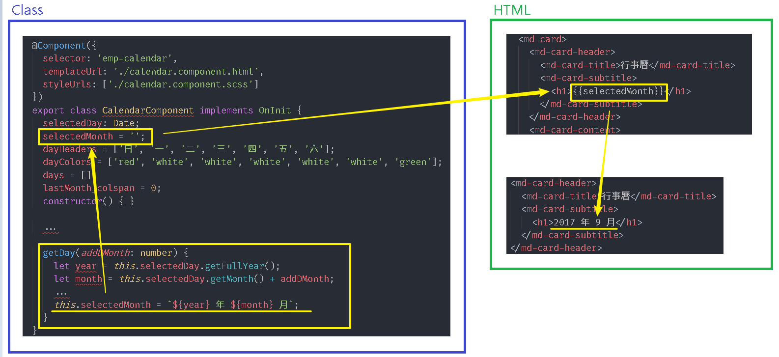
編輯 calendar.component.ts。
calendar.component.ts1
2
3
4
5
6
7
8
9
10
11
12
13
14
15
16
17
18
19
20
21
22
23
24
25
26
27
28
29
30
31
32
33
34
35
36
37
38
39
40
41
42
43
44
45
46
47
48
49
50
51
52
53
54
55
56
57
58
59
60
61
62
63
64
65
66
67
68
69
70
71
72
73
74
75
76
| import { Component, OnInit } from '@angular/core';
@Component({
selector: 'emp-calendar',
templateUrl: './calendar.component.html',
styleUrls: ['./calendar.component.scss']
})
export class CalendarComponent implements OnInit {
selectedDay: Date;
selectedMonth = '';
dayHeaders = ['日', '一', '二', '三', '四', '五', '六'];
dayColors = ['red', 'white', 'white', 'white', 'white', 'white', 'green'];
days = [];
lastMonth_colspan = 0;
selectedItem: any;
constructor() { }
ngOnInit() {
this.getToday();
}
getToday() {
this.selectedDay = new Date();
this.getDay();
}
getDay(addDMonth: number = 0) {
let year = this.selectedDay.getFullYear();
let month = this.selectedDay.getMonth() + addDMonth;
const dt = new Date(year, month, 1);
year = dt.getFullYear();
month = dt.getMonth();
const maxDay = new Date(year, month + 1, 0).getDate();
const newDay = this.selectedDay.getDate();
this.selectedDay = new Date(year, month, (newDay < maxDay) ? newDay : maxDay);
const dayNumber = this.selectedDay.getDate();
this.lastMonth_colspan = new Date(year, month, 1).getDay();
const _days = [];
for (let day = 1; day <= 31; day++) {
const time = new Date(year, month, day);
if (time.getMonth() > month) {
break;
}
const isSelected = time.getDate() === dayNumber;
const d: any = {
isSelected: isSelected,
datetime: time,
day: day,
week: time.getDay()
};
if (isSelected) {
this.selectedItem = d;
}
_days.push(d);
}
this.days = [..._days];
month++;
if (month === 13) {
month = 1;
year++;
}
this.selectedMonth = `${year} 年 ${month} 月`;
}
selectdDay(item: any) {
if (this.selectedItem) {
this.selectedItem.isSelected = false;
}
item.isSelected = true;
this.selectedItem = item;
this.selectedDay = item.datetime;
}
}
|
查看瀏覽器,選取效果已經出現。
模擬紀錄
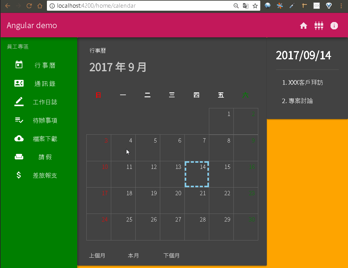
接著我們在 calendar.component.ts 內建立一個讀取紀錄的方法-getNote(),並透過亂數函式來產生一些紀錄。
calendar.component.ts1
2
3
4
5
6
7
8
9
10
11
12
13
14
15
16
17
18
19
20
21
22
23
24
25
26
27
28
29
30
31
32
33
34
35
36
37
38
39
40
41
42
43
44
45
46
47
48
| import { Component, OnInit } from '@angular/core';
@Component({
selector: 'emp-calendar',
templateUrl: './calendar.component.html',
styleUrls: ['./calendar.component.scss']
})
export class CalendarComponent implements OnInit {
...
getDay(addDMonth: number = 0) {
let year = this.selectedDay.getFullYear();
...
this.selectedMonth = `${year} 年 ${month} 月`;
this.getNote();
}
selectdDay(item: any) {
...
}
getNote() {
if (this.days.length > 0) {
const d = Math.floor(Math.random() * 28);
this.days.forEach(item => {
const notes = [];
if (item.week !== 0 && item.week !== 6) {
if (item.week === 1) {
notes.push('8:00 每周會議');
}
let b = Math.random() >= 0.5;
if (b) {
notes.push('XXX客戶拜訪');
}
b = Math.random() >= 0.5;
if (b) {
notes.push('專案討論');
}
if (item.day === d) {
notes.push('部門聚餐');
}
}
item.notes = notes;
});
}
}
}
|
編輯 calendar.component.html。
calendar.component.html1
2
3
4
5
6
7
8
9
10
11
12
13
14
15
16
17
18
19
| <div fxLayout="row" fxLayout.xs="column">
<div fxFlex="70" fxFlex.xs>
...
</div>
<div fxFlex>
<md-card>
<md-card-content>
<h1>{ {selectedDay | date:'yyyy/MM/dd'} }</h1>
<md-divider></md-divider>
<md-list>
<md-list-item *ngFor="let item of selectedItem.notes; let i = index">
NaN.
</md-list-item>
</md-list>
</md-card-content>
</md-card>
</div>
</div>
|
查看瀏覽器,選取日期時右邊已經會出現紀錄。
Directive:[ngSwitch]
之前我們使用了 *ngFor、*ngIf 指令,接下來我們練習另一個指令-[ngSwitch],使用上跟程式語言的 switch 語法雷同,配合 *ngSwitchCase 與 *ngSwitchDefault 與條件式比對,將符合的值所對應的樣板顯示出來,比較特別的是 ngSwitch 是用中括號([ ])包起來,而不是在前面加上星號(*)。
首先我們修改 calendar.component.ts 內的 紀錄(notes) 的資料結構,將字串陣列改成物件陣列,原本字串的內容移至物件內的 subject 屬性,並再增加 type 屬性當作分類用途。
calendar.component.ts1
2
3
4
5
6
7
8
9
10
11
12
13
14
15
16
17
18
19
20
21
22
23
24
25
26
27
28
29
30
31
32
33
34
35
36
37
| import { Component, OnInit } from '@angular/core';
@Component({
selector: 'emp-calendar',
templateUrl: './calendar.component.html',
styleUrls: ['./calendar.component.scss']
})
export class CalendarComponent implements OnInit {
...
getNote() {
if (this.days.length > 0) {
const d = Math.floor(Math.random() * 28);
this.days.forEach(item => {
const notes = [];
if (item.week !== 0 && item.week !== 6) {
if (item.week === 1) {
notes.push({ type: 1, subject: '8:00 每周會議' });
}
let b = Math.random() >= 0.5;
if (b) {
notes.push({ type: 2, subject: 'XXX客戶拜訪' });
}
b = Math.random() >= 0.5;
if (b) {
notes.push({ type: 3, subject: '專案討論' });
}
if (item.day === d) {
notes.push({ type: 4, subject: '部門聚餐' });
}
}
item.notes = notes;
});
}
}
}
|
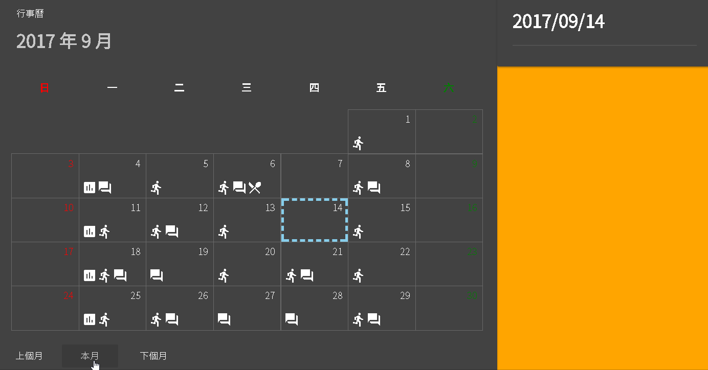
接著編輯 calendar.component.html,透過 [ngSwitch] 指令來依紀錄分類顯示對應的圖示。
calendar.component.html1
2
3
4
5
6
7
8
9
10
11
12
13
14
15
16
17
18
19
20
21
22
23
24
25
26
27
28
29
30
31
32
33
| <div fxLayout="row" fxLayout.xs="column">
<div fxFlex="70" fxFlex.xs>
<md-card>
...
<md-card-content>
<md-grid-list cols="7" rowHeight="68px">
<md-grid-tile *ngFor="let header of dayHeaders; let i = index" [ngStyle]="{'color': dayColors[i]}">
<h3>{ {header} }</h3>
</md-grid-tile>
<md-grid-tile [colspan]="lastMonth_colspan" *ngIf="lastMonth_colspan"></md-grid-tile>
<md-grid-tile *ngFor="let item of days" [ngStyle]="{'color': dayColors[item.week]}" class="day" (click)="selectdDay(item)">
<div fxFill *ngIf="item.isSelected" class="selected"></div>
<span class="text">{ {item.day} }</span>
<div fxFill fxLayout="row" fxLayoutAlign="start end" class="note">
<ng-container *ngFor="let note of item.notes">
<ng-container [ngSwitch]="note.type">
<md-icon *ngSwitchCase="1">assessment</md-icon>
<md-icon *ngSwitchCase="2">directions_run</md-icon>
<md-icon *ngSwitchCase="3">forum</md-icon>
<md-icon *ngSwitchCase="4">local_dining</md-icon>
<md-icon *ngSwitchDefault="">alarm</md-icon>
</ng-container>
</ng-container>
</div>
</md-grid-tile>
</md-grid-list>
</md-card-content>
...
</md-card>
</div>
...
</div>
|
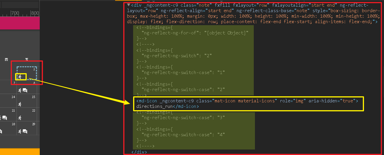
ng-container 是一個比較特別的 tag,因為在執行時期它不會出現在樣板上,所以很適合拿來拆解過長的指令,例如我們需要在包含 *ngFor 指令的樣板元素內再加上 *ngIf 指令,以往方式可能將 *ngFor 往上拉一層並透過 div tag 包覆,但是會造成每個元素都多包一個 div,這不只會增加運算成本,div 還有機會被其他 CSS 樣式影響而造成版面效果與預期不同,這時如改用 ng-container 來替換,因為不會輸出成 tag 所以不會增加運算成本也不會受到 CSS 樣式影響。
檢視範例的內容可以發現最終只剩下 md-icon tag,綠色區塊是 [ngSwitch] 產生的樣板,但是最後輸出時會被標示成註解。
編輯 calendar.component.scss,增加 note 樣式。
calendar.component.scss1
2
3
4
5
6
7
8
9
10
11
12
13
14
15
16
17
18
19
20
21
| .day {
border: solid 1px DimGray;
.text {
position: absolute;
top: 4px;
right: 8px;
}
.selected {
position: absolute;
top: 0px;
left: 0px;
box-sizing: border-box;
border: dashed 4px skyblue;
}
.note {
position: absolute;
bottom: 4px;
left: 4px;
}
}
|
查看瀏覽器,日期下方多了圖示。

[**first-app_2017-09-13.zip**](/uploads/first-app_2017-09-13.zip)